
.webp)



May 11
Why we went beyond green.
And why that matters.
For a design agency working in climate tech, the rebrand conversation could have been very short. A deeper green, perhaps a sage or a new accent, an elevated look.
No one would ever question it.
When we got to it at Heights, we chose to do something different.
The end of the green era
Green has been the colour of sustainability for over twenty years, and it made sense.It built recognition, created a visual shorthand, and gave people an immediate signal: this company cares about the planet. In every climate brand, impact report, ESG dashboard, green was doing its subtle but consistent reassurance.
But it’s 2026, and the climate conversation has outgrown its original look and feel. The climate crisis isn't contained to an environmental category anymore. It runs through energy, food, healthcare, supply chains, capital, and beyond. Yet the visual language around it has hardly changed.
Beyond that, the most successful climate tech companies out there don't need a green logo to prove their mission. Their team, product and operations do that. The values are embedded in how they work rather than how they look. They are performing as well, if not better, than any business-as-usual competitor, while offering a net-positive outcome for all.
When it came to rethink our own brand, the direction was all too obvious: we believe sustainability can compete at parity with everything else, so our identity should too.
What parity looks like for us
From a brand strategy point of view, we moved our domain from greenheights to heights. An on the nose qualifier doesn't need to sit in our name when it's the foundation for everything we do.
We translate it through our work, not our brand. That shift in mentality shaped every design decision that followed.
From a design standpoint, we built the new look and feel on a high-contrast black and white, with generous empty space and clean sans-serif typography.
Our clients are the spotlight, not Heights. The layouts are designed to frame their work and let it breathe, so that when you land on our site, you see what Heights can do for you rather than how clever our own brand is.
As a nod to our history, we added a new lime green accent in a few key places. It's our link to who we were and a reminder of how far we’ve come.
And then there's the unexpected touches of orange.It started as a conversation about the constant energy and optimism we use in our work as a team, but it quickly became something bigger.
If the climate crisis now touches every area of our lives in ways that are both imperceptible and deep running, why should the visual language of the companies addressing it stay locked in one narrow band of the spectrum? Twenty years of climate branding have been overwhelmingly green, and while that made sense when sustainability needed its own category. That era is ending.
Incidentally, the world is, by every scientific measure, on fire. There's something honest about letting our brand acknowledge the urgency of the crisis with a strong colour, rather than defaulting to the reassuring earth tones that have become the industry standard.
The shift we encourage our clients to make
The companies we work with are often at a stage where their positioning is still catching up with their ambition. You have built something that solves a real problem, but the way you present it still leans on the familiar sustainability signals — the green, and everything that comes with it.
And I get it: that's what the category has always looked like.
What we're pushing for is a move away from signalling values and towards embedding them in everything you do. Let the product, the user experience, the campaigns speak for themselves. Compete on quality, clarity, on the strength of what you're actually building, and let the impact follow. From a business point of view as well as a visual one.
The companies that make that shift reach a much wider audience, because they're no longer asking people to care about sustainability first and the product second. They're just offering something better.
That, in the end, is what parity means. That's what the next generation of climate tech brands will look like.
Heights.digital is live
The new site is where the work lives now, and the writing too.It's the clearest version yet of what we believe.
Go take a look around!
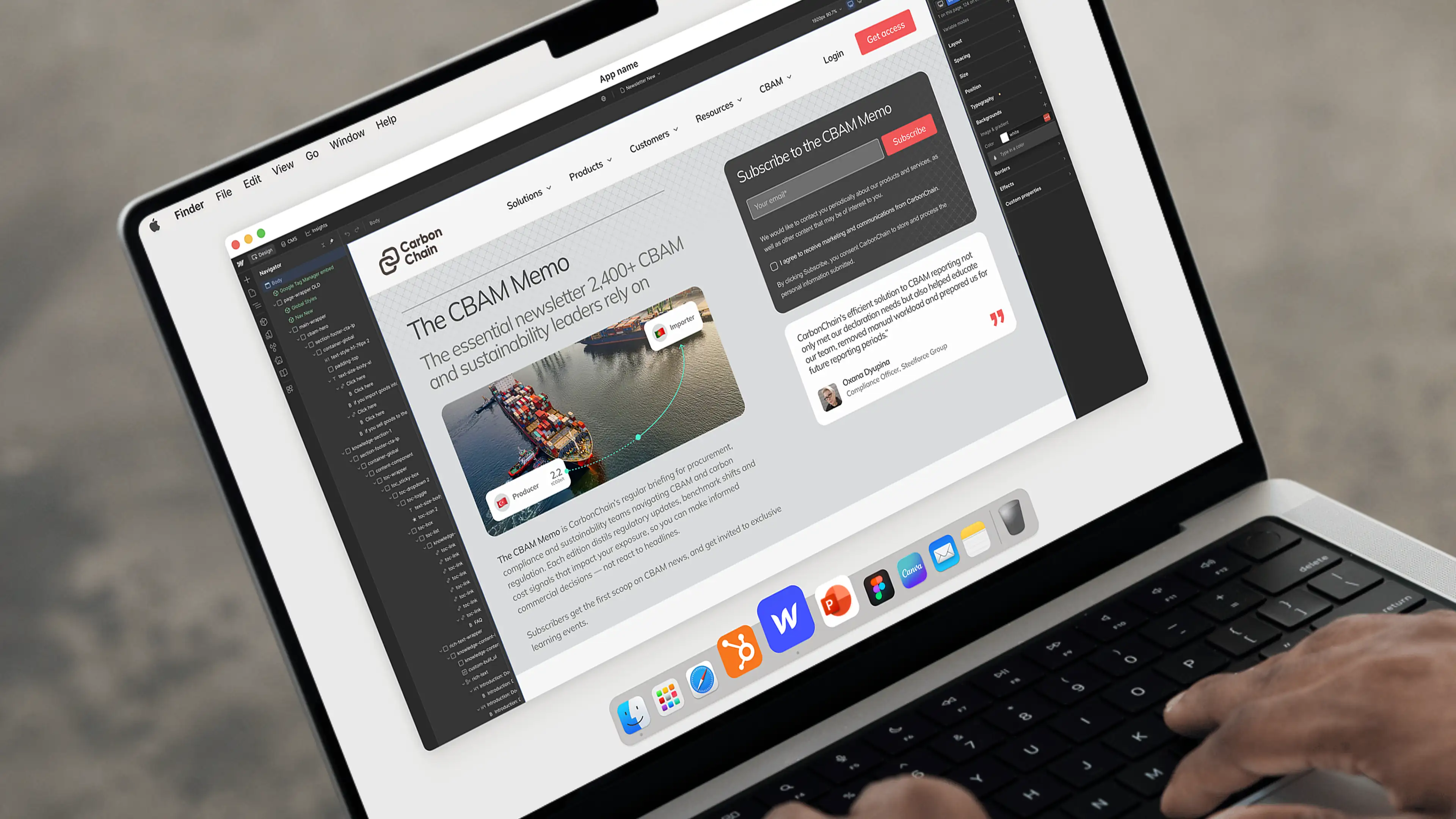
CarbonChain
Supply chain carbon emissions platform helping companies measure, manage and report on their climate impact
Sprout*
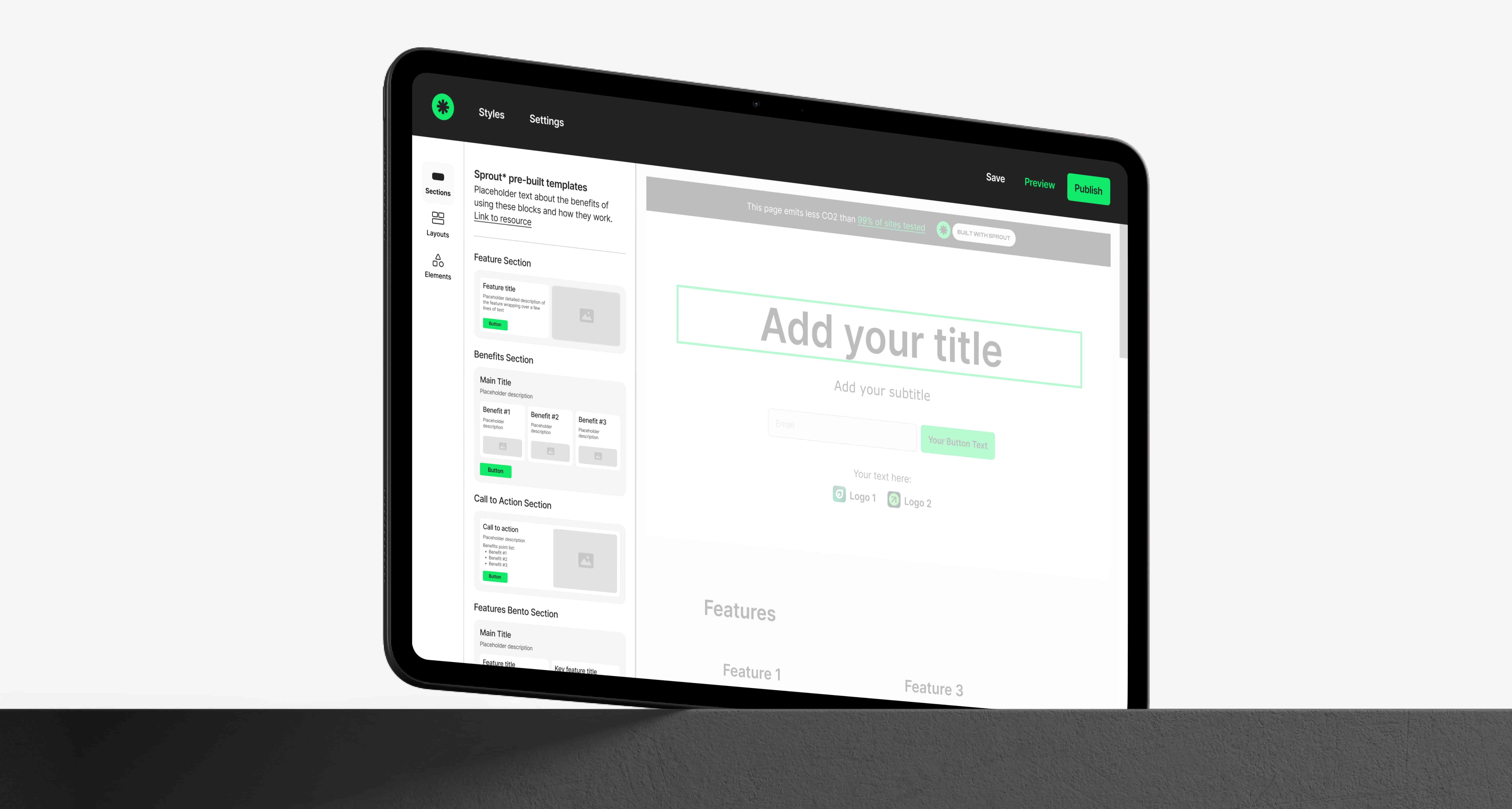
No-code website builder helping purpose-driven organisations create beautiful sites that emit up to 99% less CO2