
.webp)


May 13
What great impact design looks like right now
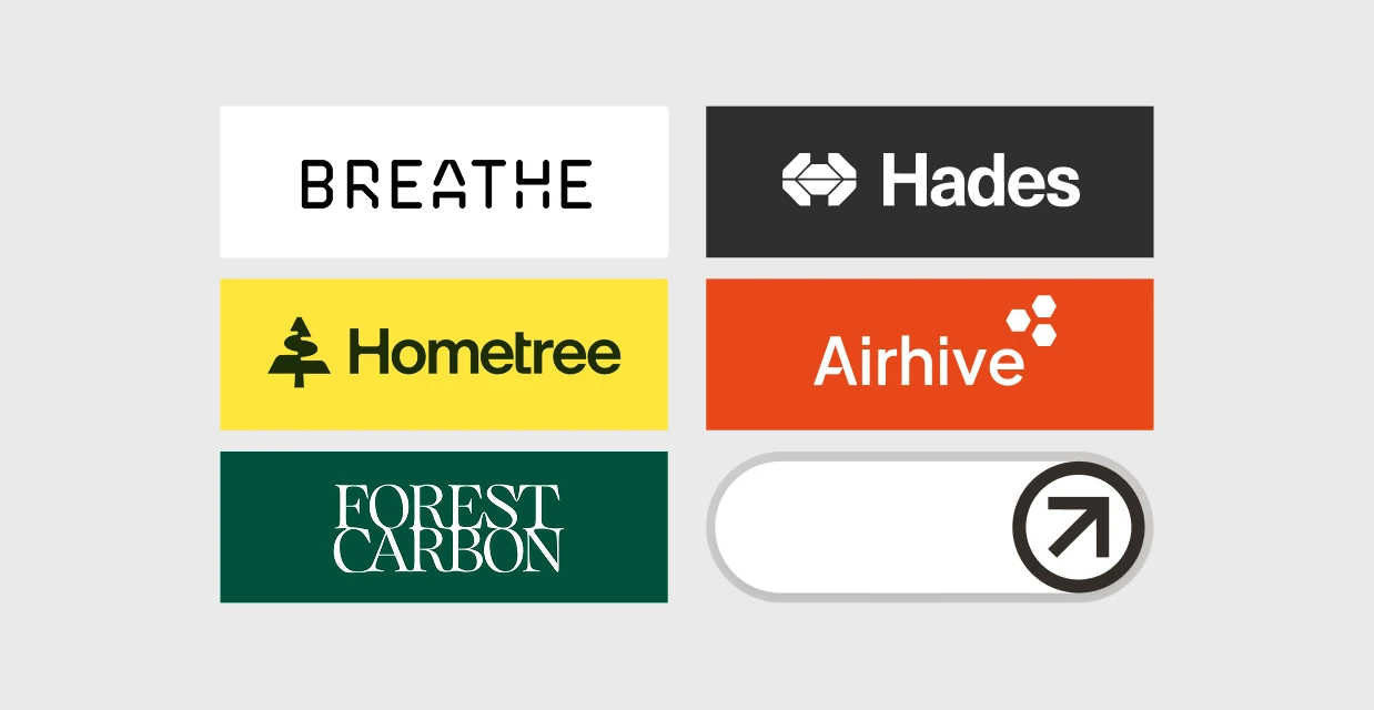
Five recent brand projects from the climate and impact space that redefine the way it’s done.
The brands below have recently been through significant design processes, and what they share is worth paying attention to. None of them rely on the familiar visual language of sustainability and instead found a way to look like what they actually are: ambitious, technically serious and ready for scale.
Hometree:
warmth and reassurance
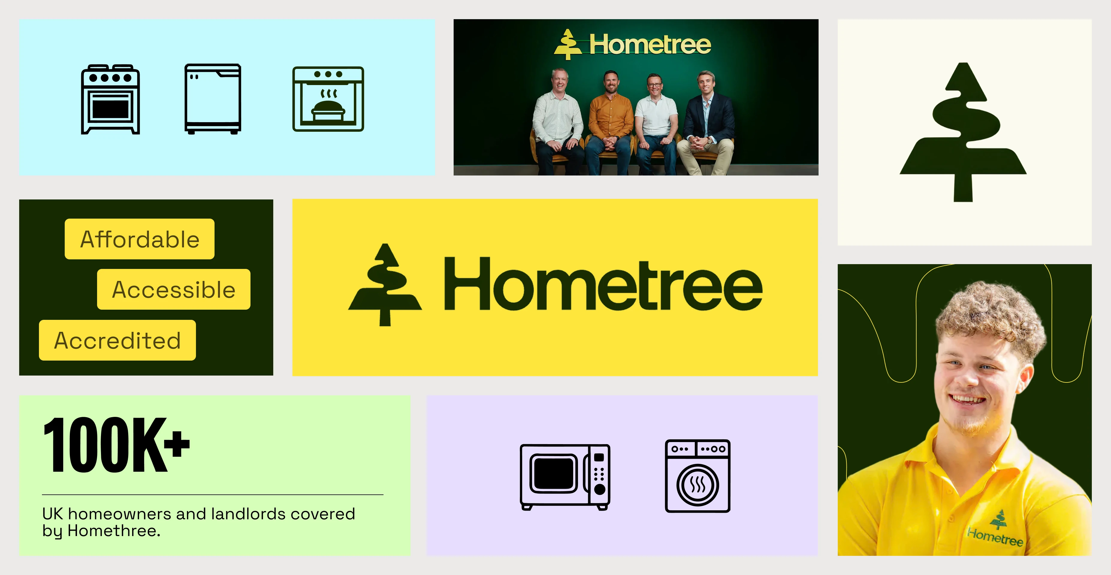
Hometree is a UK energy services company helping homeowners transition to lower-carbon heating across the full lifecycle: heat pumps, solar, battery storage, financing and insurance. The design challenge was that this sits at the intersection of two deeply unsexy categories (home insurance and the energy transition) and the previous brand was getting lost somewhere between the two.
The rebrand repositioned Hometree around a concept called "Transition Companion," which sidesteps the anxiety that most green energy messaging accidentally creates. Rather than leading with the climate crisis and hoping people feel motivated enough to act, the new brand leads with warmth and reassurance.
The colour palette is deliberately not the muted greens you'd expect. An illustrated icon system makes complex product information (financing options, energy lifecycle, installation steps) feel navigable rather than overwhelming. A brand mascot, Maple, works across the identity as both logo and interactive assistant on the site.
The takeaway: if your product helps people through a transition they find confusing or intimidating, the brand's first job is to lower the emotional barrier to entry, not raise awareness of the problem.
Airhive:
from complex to simple
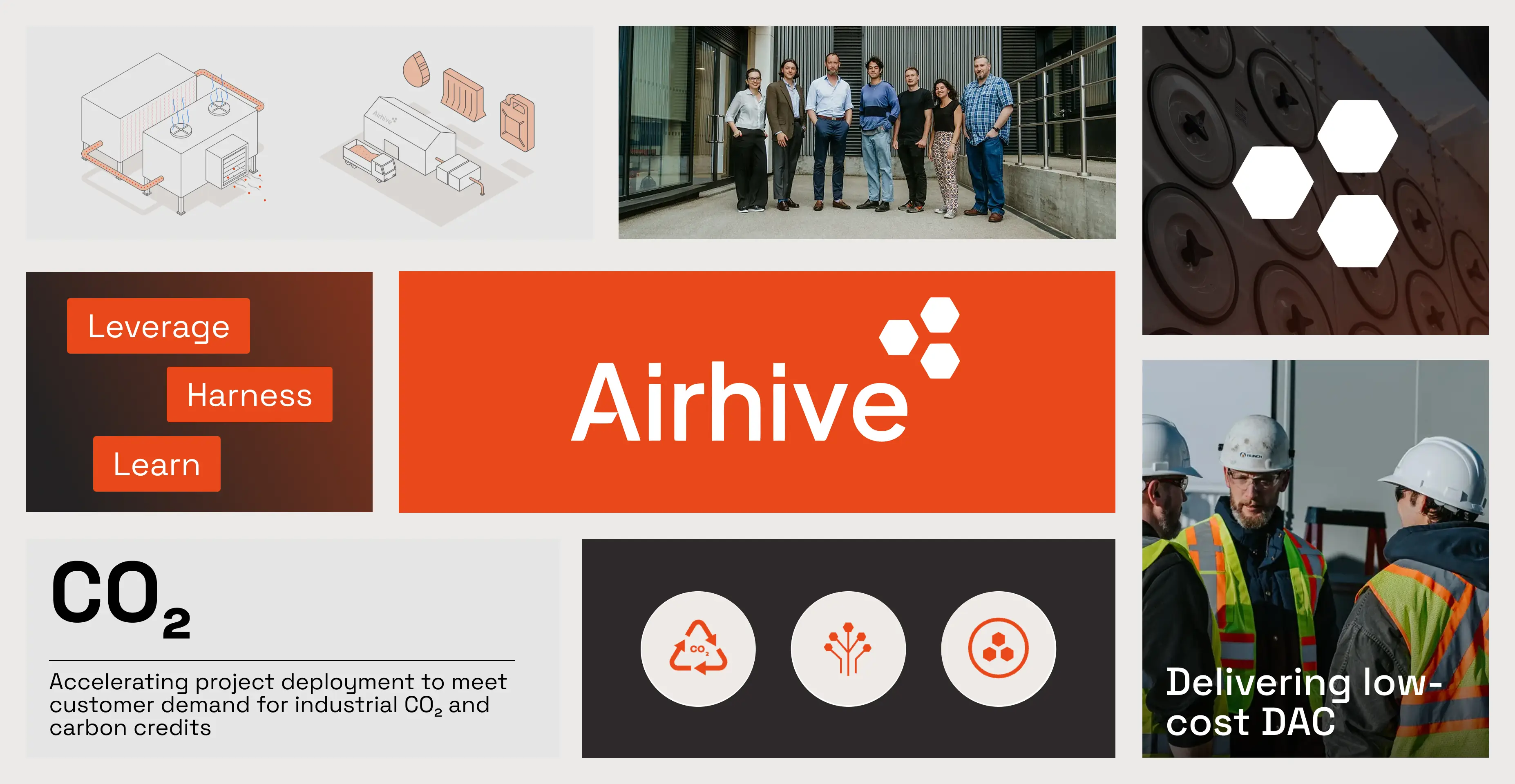
Airhive builds direct air capture systems that remove CO₂ from the atmosphere using mineral-based processes, with modular units that fit inside shipping containers. The challenge was the one that faces almost every pre-commercial hardware startup: the science was strong but the story wasn't landing with investors or partners.
The rebrand focused on translation of complex to simple. Complex lab-based technology needed to be communicated clearly enough for investors, project partners and potential recruits to understand what they were looking at and why it mattered. The result is clean, confident, and lets the technology do the talking. The site architecture guides different audiences (credit buyers, industrial partners, potential hires) without trying to be all things on one page. After the rebrand, Airhive became a finalist in the $100 million XPRIZE Carbon Removal Prize.
The takeaway: when your technology is genuinely novel, the brand's job is clarity, not cleverness. Make the complex accessible without dumbing it down, and let the product be the impressive thing.
Hades Mining:
brave brand for brave ideas
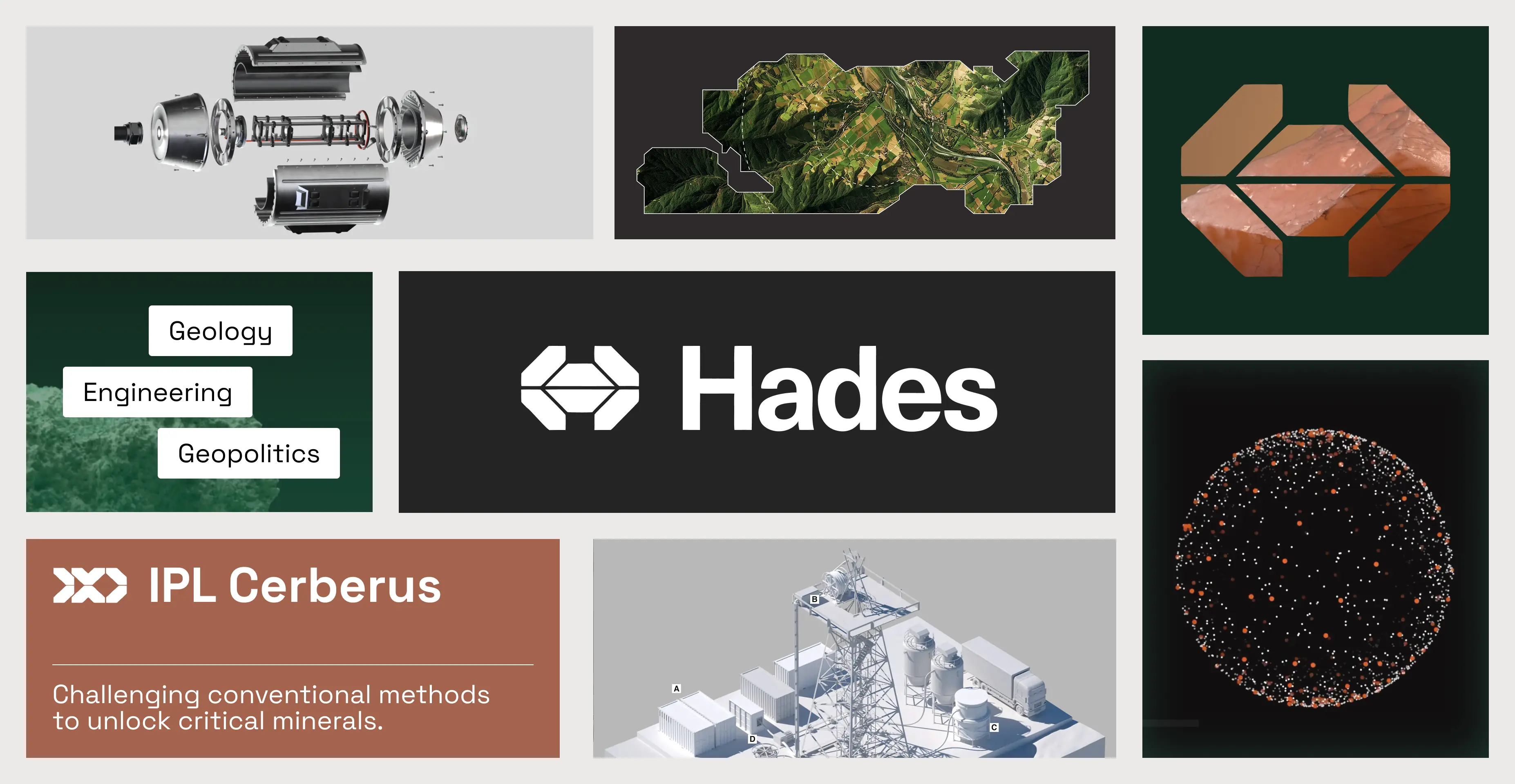
Hades is a Munich-based startup developing laser drilling technology to access critical minerals and geothermal energy deep beneath European soil. The name alone tells you everything about the brand's posture: this is not a company reaching for calming greens and gentle messaging. Their tagline is "Sovereignty starts subsurface."
The identity is dark, bold and industrial, with a visual language drawn from geology and engineering rather than sustainability. Deep blacks, mineral photography, and video of laser-fractured rock. It reads like a defence tech company or a high-end materials science lab, which is entirely the point. Hades raised €20.5 million within six months of launching. When your pitch is about European strategic autonomy and drilling five kilometres into hard rock with lasers, looking like an environmental nonprofit would actively undermine the message.
The takeaway: let the brand match the ambition of what you're actually building. If the product is bold and technically aggressive, the design should be too.
Forest Carbon:
identity grown from action
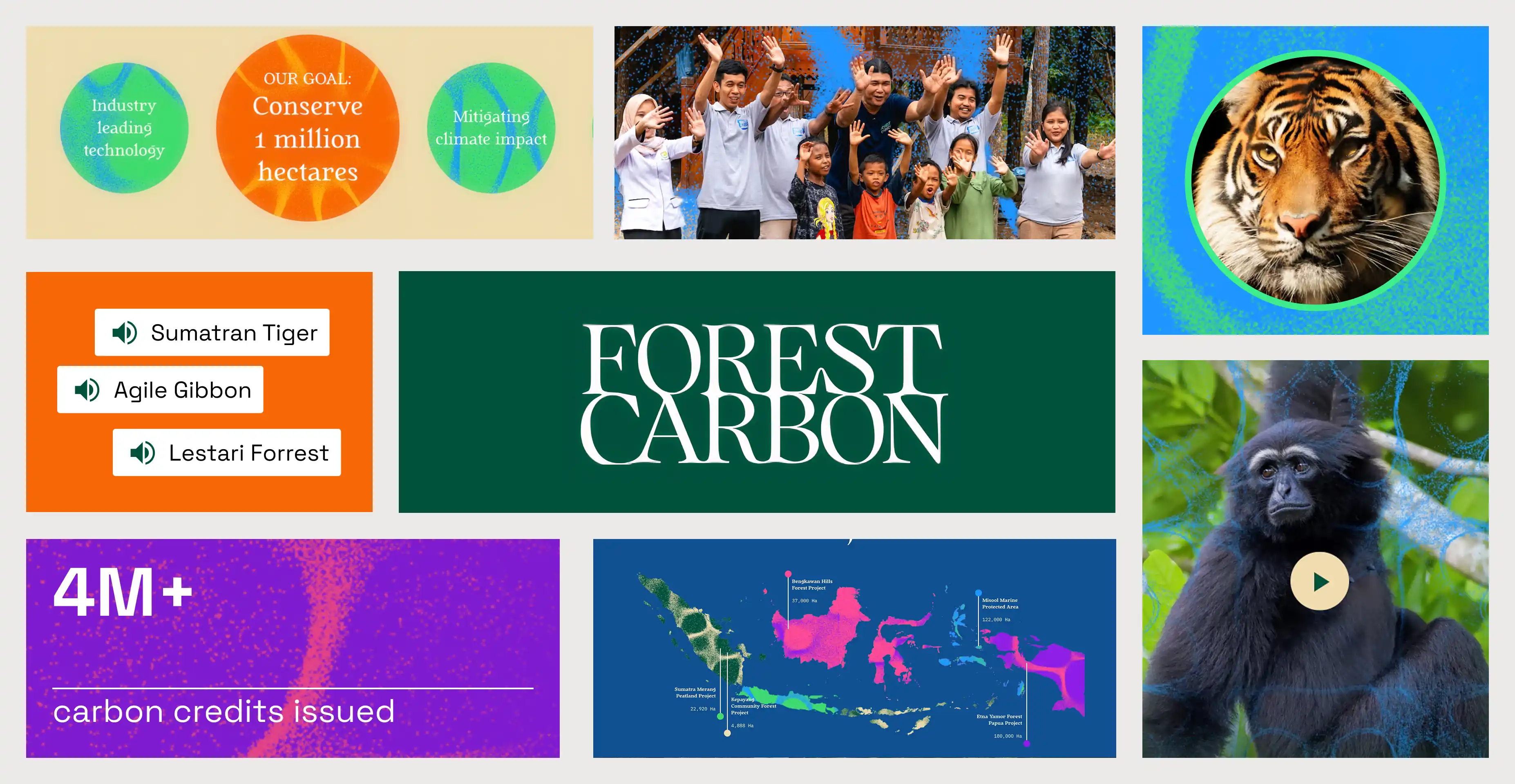
Forest Carbon is a Jakarta-based ecosystem restoration company that works to revive degraded wetland forests across Southeast Asia. The carbon credit market is plagued by credibility concerns, and Forest Carbon needed a brand that communicated both emotional resonance and scientific rigour.
The identity is built from a genuinely original idea. Forest Carbon uses bioacoustics (recordings of returning birds, frogs and endangered species) to measure how far a forest's restoration has progressed. A custom digital tool translates those recordings into Chladni patterns, which are visual representations of sound frequencies, and these patterns became the core of the visual system. The identity is literally generated by the health of the ecosystems Forest Carbon protects. Paired with typography inspired by scientific journal publications, the result won Fast Company's 2025 Innovation by Design award for the Asia-Pacific region.
The takeaway: if your work involves something genuinely unique, find the design concept inside the thing itself. The most memorable brand identities aren't applied from outside. They emerge from what the company actually does.
Breathe Battery Technologies:
leading with advantage
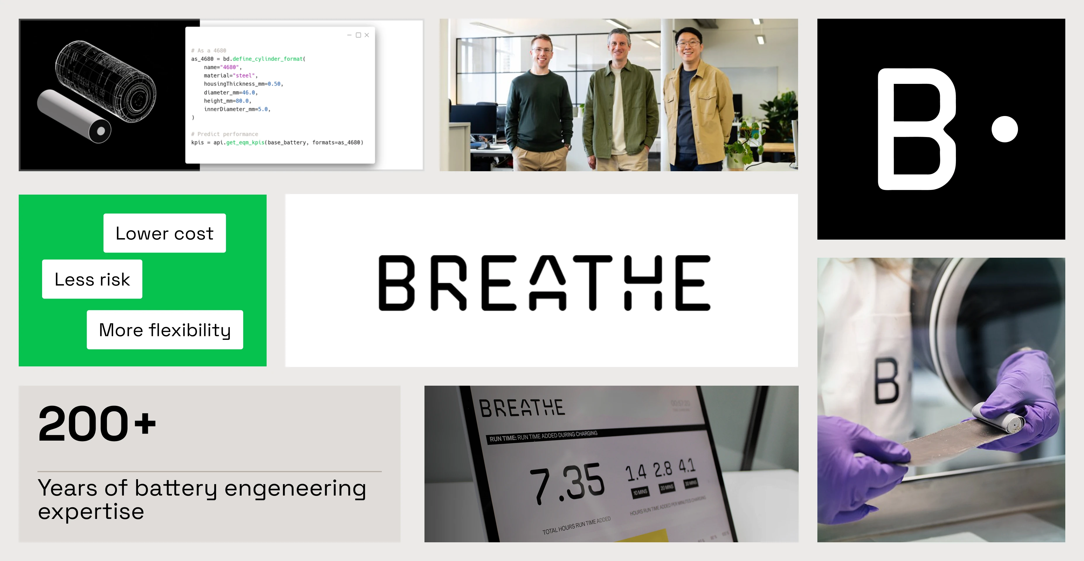
Breathe is a London-based company (spun out of Imperial College) building physics-based battery management software. Their technology makes batteries charge faster and last longer without any physical hardware changes. Clients include Volvo, who integrated Breathe's adaptive charging into their latest EV lineup, achieving an 18-minute charge time.
The identity positions Breathe as a premium technology company, full stop. The brand doesn't lead with its environmental impact (though making batteries last longer has obvious sustainability implications). It leads with performance, precision and the elegance of a software-only solution. The visual language is clean and technical, with enough warmth to avoid feeling cold or corporate.
The takeaway: sometimes the most effective sustainability positioning is not positioning around sustainability at all. If your product delivers a measurable performance advantage that happens to reduce waste, lead with the advantage.
The thread connecting all five
Hometree looks welcoming. Airhive looks precise. Hades looks formidable. Forest Carbon looks alive. Breathe looks like the future of battery technology. None of them look "sustainable" in the way the category has taught us to expect.
What they share is that each designed for what they're becoming, not for the category they emerged from. The distinction between performing sustainability and simply being a serious company that solves a real problem is where the next generation of impact brands will be built.
It is not about looking sustainable. It is about creating a brand that will win in the long run.
CarbonChain
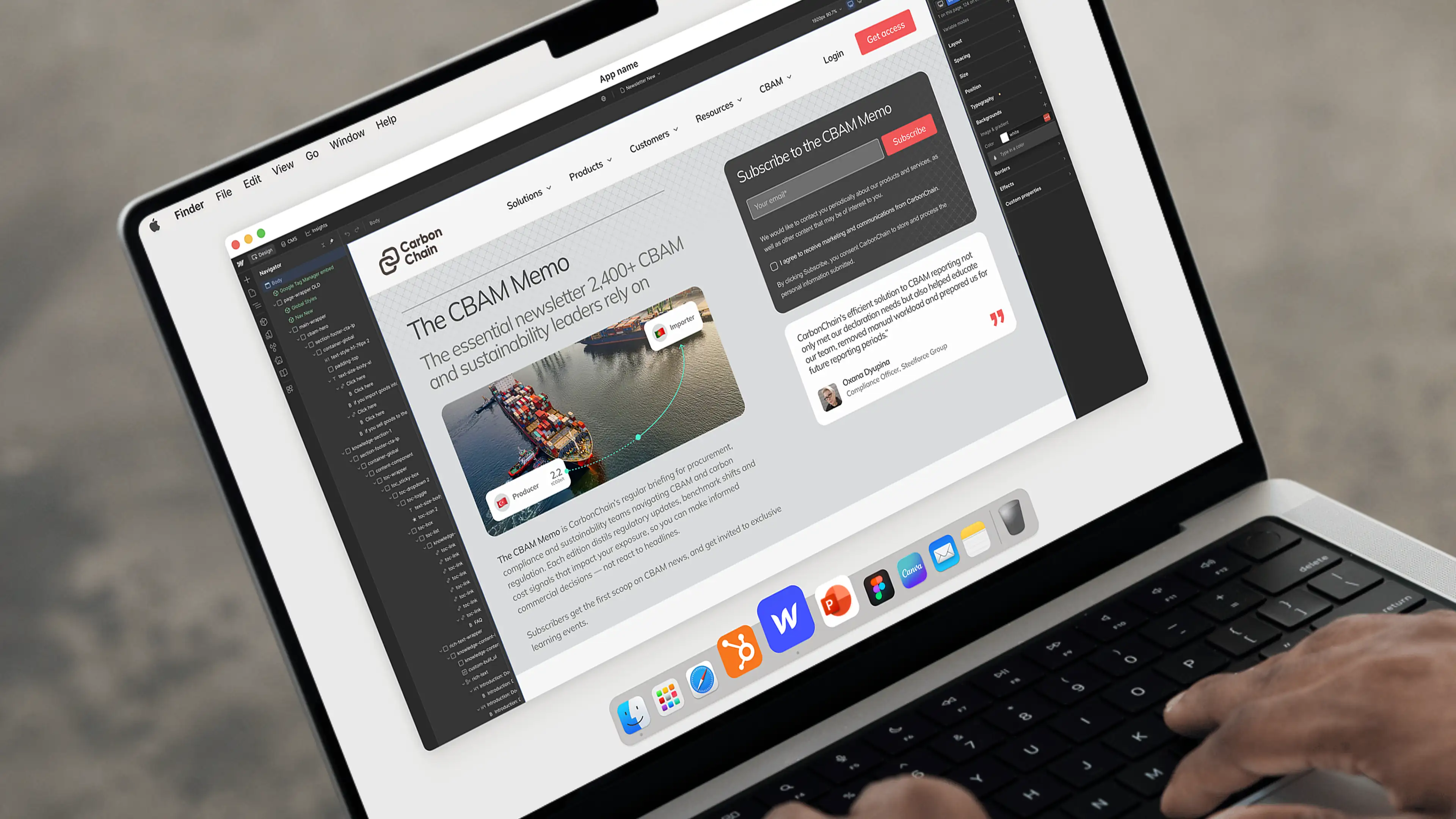
Supply chain carbon emissions platform helping companies measure, manage and report on their climate impact
Sprout*
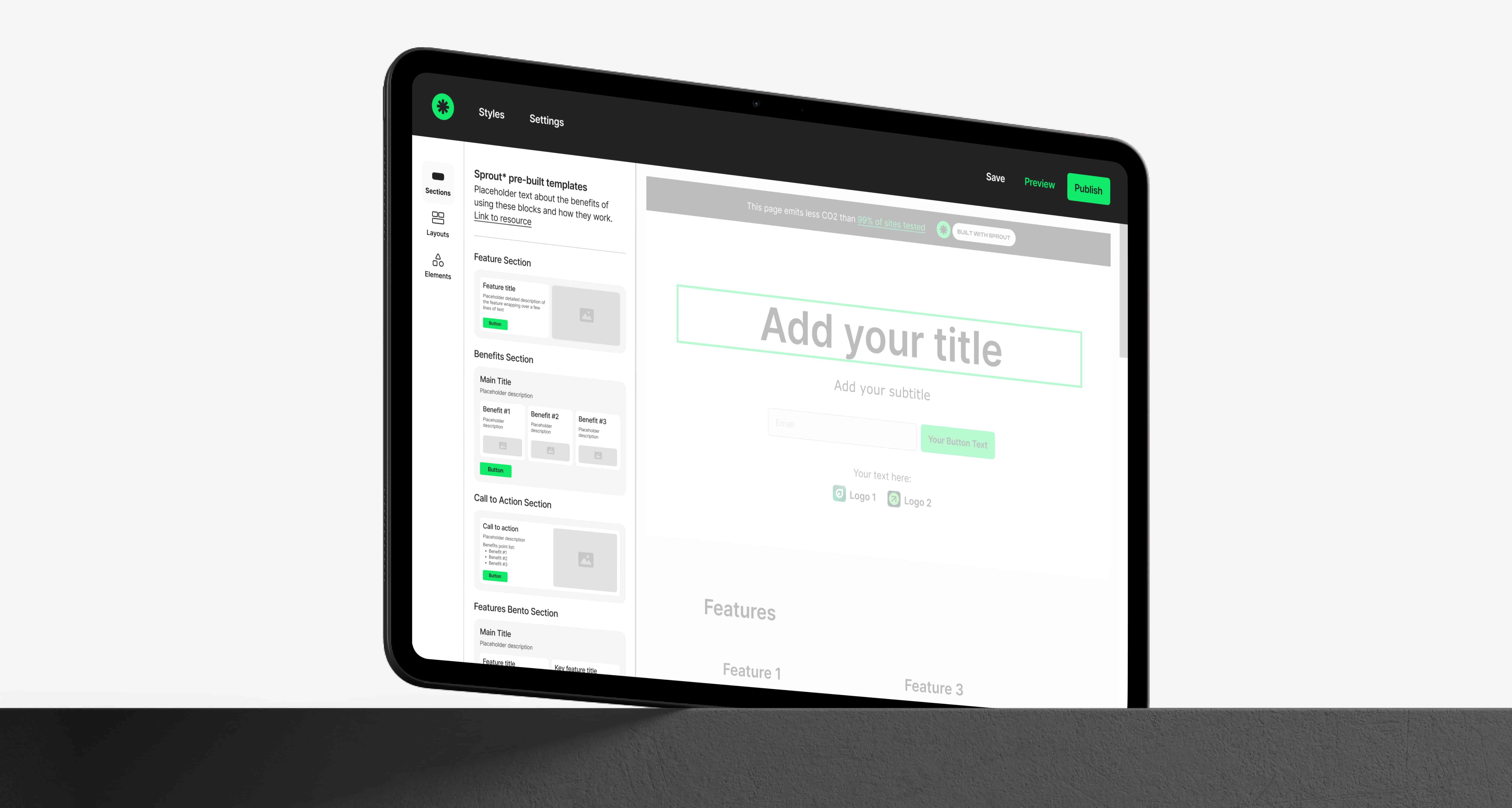
No-code website builder helping purpose-driven organisations create beautiful sites that emit up to 99% less CO2